

Health-Union.com | process
I was tasked to represent the story and values of Health Union through a clear and user-friendly online experience. This site serves as the business heart of Health Union and is the key tactic they use to reach new partners and future employees.
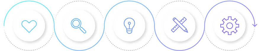
Empathize
Learn about user
• User interviews
• Stakeholder interviews
• Surveys
• Data Analysis
• Competitive research
Define
Determine features
• Personas
• User journeys
• Problem statement
• Competitive
analysis
Ideate
Brainstorm solutions
• Brainstorm sessions
• Storyboards
• Card sorting
• User flows
• User journeys
• Effort vs impact matrix
Prototype
Symulate user experience
• Paper wireframes
• Micro-interactions
• Digital wireframes
• Interactive prototypes
• Design documentation
• Design hand-offs
Test
Validate with users
• Usability testing
• QA
• A/B TESTING
• System usability scale (SUS)
• Observations
• Eye-tracking
Empathize
As a team, we immersed ourselves in the world of the people we were designing for. We observed, interviewed, and engaged with them to truly understand their needs, desires, and challenges. By putting ourselves in their shoes, we developed empathy and gained deep insights into their experiences.

Stakeholder interviews
We collected the goals and visions for the site from the executive team and other high level individuals. We collected the primary objectives and key business results that they were looking for.

Site
Metrics
We analyzed how the site was currently being used and what pages were under-performing.

Competitive
Analysis
We spent time reviewing other industry leaders and looked closely at how they were organizing their content and positioning themselves.

User interviews
We interviewed a number of current clients and potential clients to gain more information about who they are and how they use our services. Additionally, we conducted interviews with representatives from the Community team, the Sales team, and the Human Resources team.
Define
Once we gathered all the information and insights, we analyzed and synthesized them to define the core problems or opportunities that we wanted to address. We carefully framed these as clear problem statements or design challenges, ensuring that we had a solid understanding of what we needed to solve or explore.

User #1
Occupation | Pharma Marketer
Bio | A 32-year-old creative marketer looking for targeted advertising placements and insights about the patient demographic she is seeking to reach.
Name | Stacey Miller

User #2
Occupation | Job Searching
Bio | A 28-year-old empathetic professional looking to use his writing & social media management skills. He is looking for meaningful work that helps others.
Name | Mark Welch

User #3
Occupation | Business Owner
Bio | A 50-year-old migraine sufferer looking for an online community in order to connect with others. She is looking for more information about her illness and hoping to find support.
Name | Jess Jones


The goals
-
Understand the users
-
Share a clear brand story
-
Help users quickly navigate to relevant content
-
Lower the bounce rate
-
Increase the time on site
-
Implement lead tracking
The problems
-
Confusing brand story
-
Unclear navigation
-
High bounce rate
-
Low time on site
-
No lead tracking
In numbers
84.88% bounce rate
0:55 avg. time on site


Ideate
Together, we unleashed our creativity and generated a wide range of ideas without any judgment. We brainstormed and explored different possibilities for solving the defined problem. Through sketching, and other ideation exercises, we pushed ourselves to think innovatively and came up with diverse ideas.

Brainstorm session
During these times, no idea was off-limits. We pushed ourselves to come up with many solutions to help solve the problems that the user and site performance revealed.

User flows
We placed ourselves in the user’s shoes and determined clear paths they could take to get to their desired location.

Effort vs impact matrix
Though all ideas are worth sharing, not are all worth creating. We used this stage to focus in on the ideas that would be most effective towards our goals.
Prototype
With a bunch of ideas in hand, we transformed them into tangible representations. We created prototypes, first low-fidelity and then high-fidelity, to bring our ideas to life. These prototypes served as a means to gather feedback and test concepts, allowing us to quickly learn and refine the design solution.

Wireframe Sketches
We often begin the design process by creating sketch wireframes before moving on to more polished and designed versions. Starting with sketch wireframes allows us to iterate rapidly, exploring different ideas and refining the design quickly. These wireframes focus on the core structure and layout, enabling us to clarify the conceptual framework and user flow without getting caught up in visual details.

Low-fidelity wireframes
We then created low-fidelity designs to explore initial concepts and gathered feedback from users and stakeholders. Through usability tests and active engagement, we sought input to identify usability issues and areas for improvement. Based on the feedback received, we iterated on the low-fidelity designs, making necessary refinements and incorporating suggested changes.
Interactive prototypes
We then created interactive prototypes. This allowed us to conduct user experience testing by simulating interactions and transitions. We add clickable hotspots and interactive elements to replicate the user journey and gather valuable feedback on usability and flow. When presenting to stakeholders, these interactive prototypes served as effective tools for communication, allowing stakeholders to interact with the design and provide feedback.


Test
We then tested our webpages and features to ensure usability, fix errors, optimize performance, and meet accessibility standards. Testing helps us improve the user experience, identify and resolve issues, optimize speed, and make our web pages accessible to all users.

Internal testing
We internally reviewed and critiqued the site before moving on to audience testing.

Audience testing
We tested the site with both our target audiences and representatives from our company.
(SUS) Surveys
With all of our testing phases, we created system usability scale surveys to accurately receive and document feedback.
.png)
Examples from collected feedback

Iterate
After gathering feedback from users, we iterated and made changes to our designs. User feedback played a crucial role in guiding our design decisions and ensuring that we were meeting their needs and expectations. By embracing an iterative approach, we were able to refine and improve our designs based on real-world user experiences, ultimately creating a more user-centered and effective solution.
After gathering feedback from users, we iterated and made changes to our designs. User feedback played a crucial role in guiding our design decisions and ensuring that we were meeting their needs and expectations. By embracing an iterative approach, we were able to refine and improve our designs based on real-world user experiences, ultimately creating a more user-centered and effective solution.

Origanal layout
We received valuable feedback from users who expressed difficulty in finding all of our services. This feedback shed light on a potential usability challenge resulting from our tabbed design, which may have hindered users' awareness of the full range of services we offer.

Revised layout
After careful consideration, we decided to adopt a three-column layout, which successfully showcased our diverse range of services. This new layout significantly improved the accessibility and visibility of our offerings, resulting in higher user engagement and increased sales for these products.


Optimize for SEO and accessibility
Ensuring our website is SEO-friendly and follows accessibility best practices is of paramount importance to us. We have implemented various optimization techniques to enhance our website's visibility in search engine results and improve its accessibility for all users. With regards to SEO, we have conducted thorough keyword research and implemented strategic optimization strategies such as optimizing meta tags, headings, and content structure. We also prioritize site speed, mobile responsiveness, and user-friendly navigation, which are vital ranking factors. Additionally, we adhere to accessibility guidelines, including proper heading hierarchy, and alternative text for images. We continuously monitor and improve our website's SEO performance and accessibility to provide the best possible user experience for all visitors, regardless of their abilities or assistive technologies used.
Launch

Day of launch
The new web pages were built on a development site. On the day of launch, we collected multiple representatives from our internal teams for a final review including the tech team, project management, the marketing team, and the SEO team. We then pushed the site live and made sure the URLs switched over properly.

Tracking & Optimizing
On an ongoing basis, we also track the performance of the pages using Google Analytics, seek to improve keyword ranking and comply with ever-changing SEO best practices.
.png)
Impact
The launch of the new health-Union.com site brought about remarkable results that exceeded our expectations. We were delighted to witness significant improvements in site-wide metrics, including reduced bounce rates and increased time spent on pages. These positive outcomes can be attributed, in part, to the diligent efforts invested in optimizing the platform. Furthermore, we achieved exceptional sales growth, surpassing our annual goals. The work carried out on this platform played a pivotal role in driving this success. We are thrilled with the outcomes achieved and remain committed to continuously enhancing the website to deliver exceptional user experiences and achieve even greater milestones in the future.
Before
82.65% bounce rate
0:56 avg. time on page
Home page
After
55.45% bounce rate
1:11 avg. time on page


Before
81.55% bounce rate
0:28 avg. time on page
Business Solutions Page
After
78.55% bounce rate
1:35 avg. time on page
Before
NA bounce rate
0:38 avg. time on page
Careers page
After
NA bounce rate
1:51 avg. time on page


Before
NA bounce rate
1:21 avg. time on page
Communities page
After
NA bounce rate
2:21 avg. time on page
